Screencasts & Software Demos
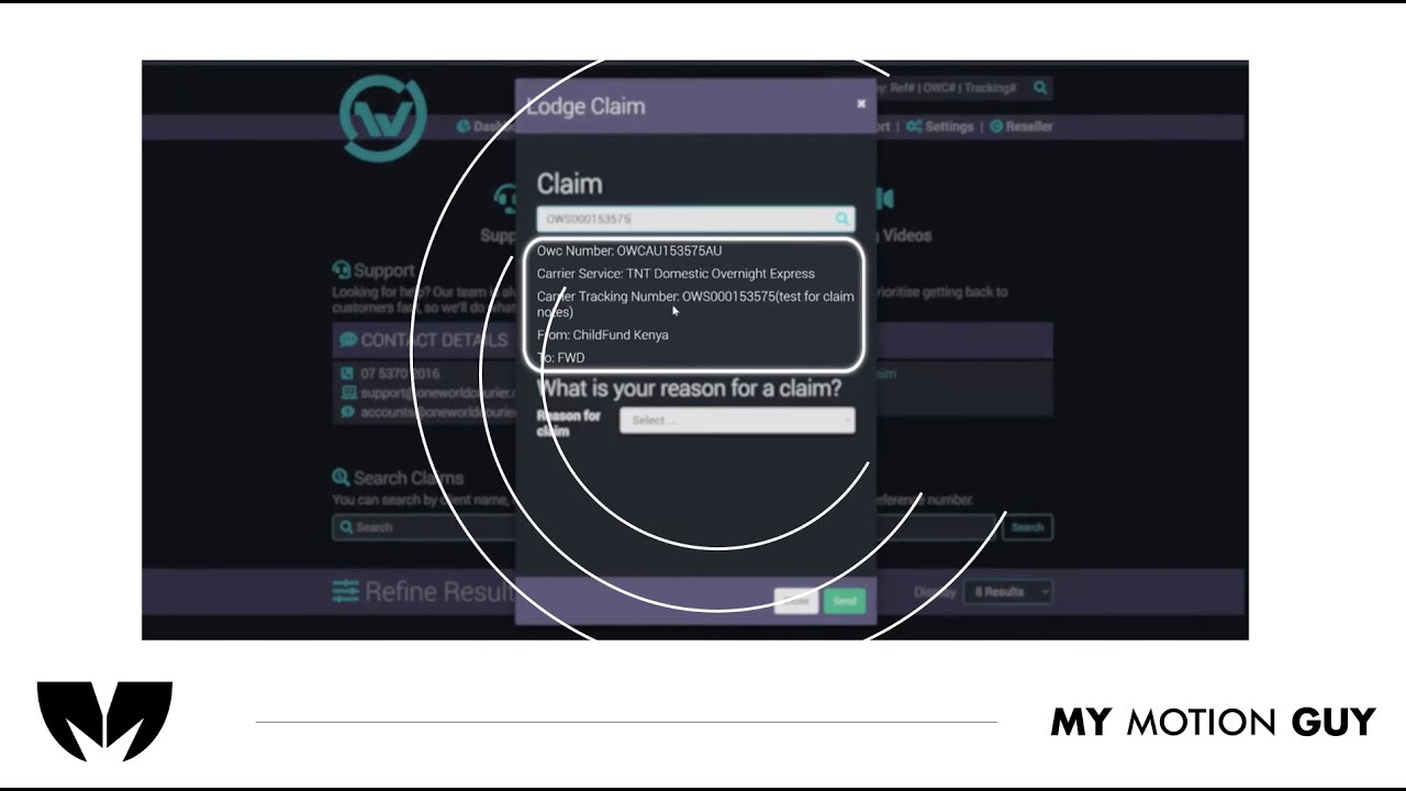
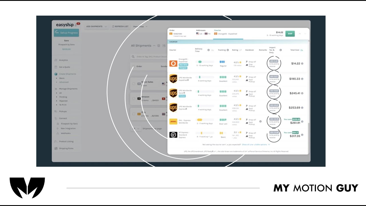
For this shipment platform screen casting tutorial, the edit is built around animated UI screens and typography to keep the walkthrough clear, step-by-step. We open with a quick UI overview, then move through each action using smooth screen-to-screen transitions (slide-ins, zoom pushes, and masked wipes) so the viewer always knows where to look. Each instruction is reinforced with crisp on-screen labels, highlights, and cursor-style movement that tracks the exact clicks and fields as the UI updates. Sound design stays subtle and functional: click taps on interactions, soft whooshes on section changes, and light risers on key completions, with a balanced music bed so the tutorial feels modern but never distracting.
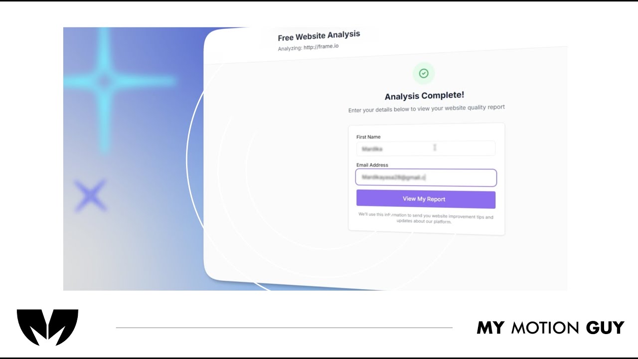
For SaaS UI walkthrough this video is edited as a UI go-through: it opens with a clean website entry, then guides the viewer through the flow using smooth scroll moves, zoom pushes, and masked wipes as screens change. When the AI analysis is introduced, we transition into the dashboard view with a crisp reveal and use minimal callouts to point to the key insight areas so the viewer immediately understands “input → analysis → results.” Sound design is matched to the UI actions with subtle click taps on interactions, soft whooshes on screen switches, and a light riser into the dashboard reveal, finished with a balanced music bed and a tidy polish pass for a premium SaaS feel.
For this travel agency digital dashboard UI walkthrough, we edited the UI flow to clearly showcase the offers and how to use each feature. The video opens with a quick dashboard overview, then moves section-by-section using smooth scroll moves, zoom pushes, and masked wipes to transition between menus and pages. Each offer reveal is reinforced with clean callouts and highlight frames that land exactly as the UI updates, making the steps easy to follow. Sound design supports the actions with subtle click taps on interactions, soft whooshes on screen changes, and light risers on key reveals, finished with a balanced music bed and a clean polish pass.
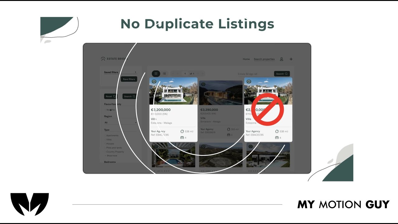
For this real estate listing platform UI walkthrough, we edited the UI to be fully visual since there’s no voice-over. The opening starts with a clean homepage/listing reveal, then the flow moves through key screens using smooth scroll moves, zoom pushes, and masked wipes to transition between search, listings, and details. Important features are communicated through minimal on-screen callouts and highlight frames timed to each UI change, while the sound approach stays intentional with subtle music only so the visuals remain the guide. A final polish pass keeps the UI crisp and consistent for a premium, website-ready demo.
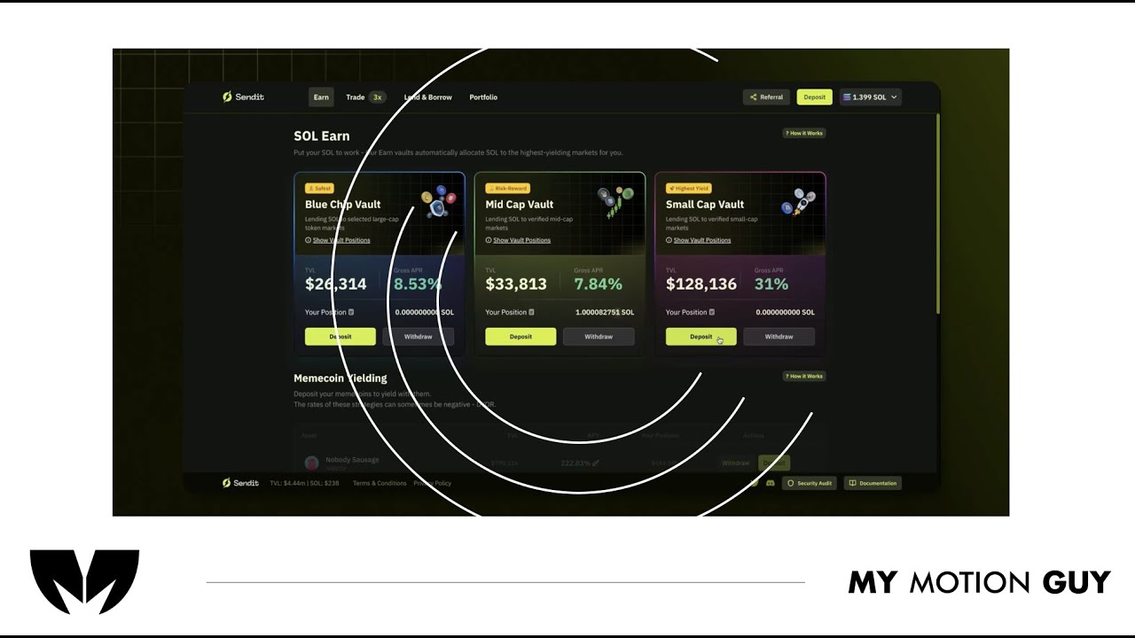
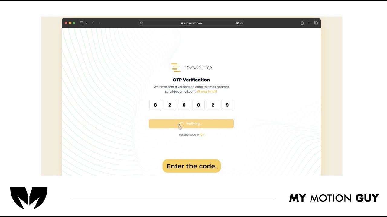
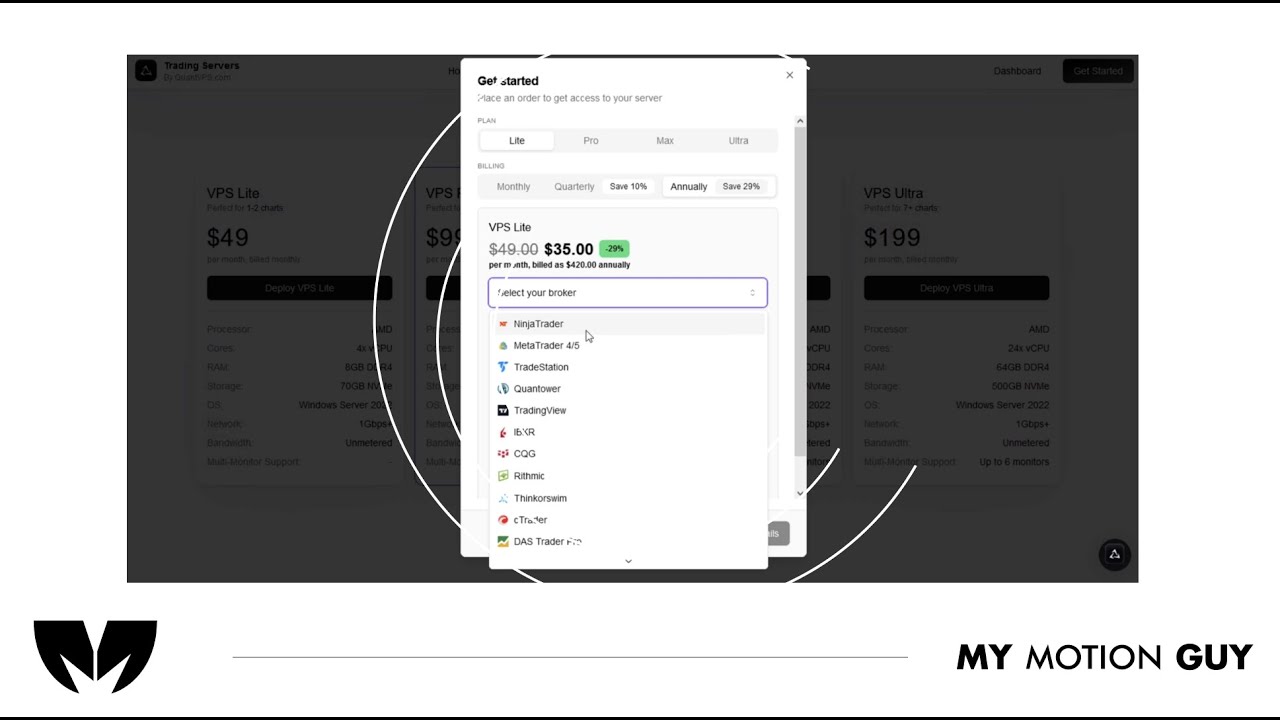
For this fintech crypto platform tutorial, we cut the UI walkthrough tightly to the voice-over so every step matches what the viewer hears. It opens with a quick dashboard overview, then moves through key actions using smooth scroll/zoom moves and clean masked wipes between screens to keep navigation clear. As features are explained, we layer minimal callouts, highlights, and cursor-led focus so the viewer instantly knows where to click and what changed on the interface. Sound work centers on clarity: VO is cleaned and leveled, music stays low, and subtle click/woosh accents land on UI interactions and screen transitions for a polished, trustworthy finish.
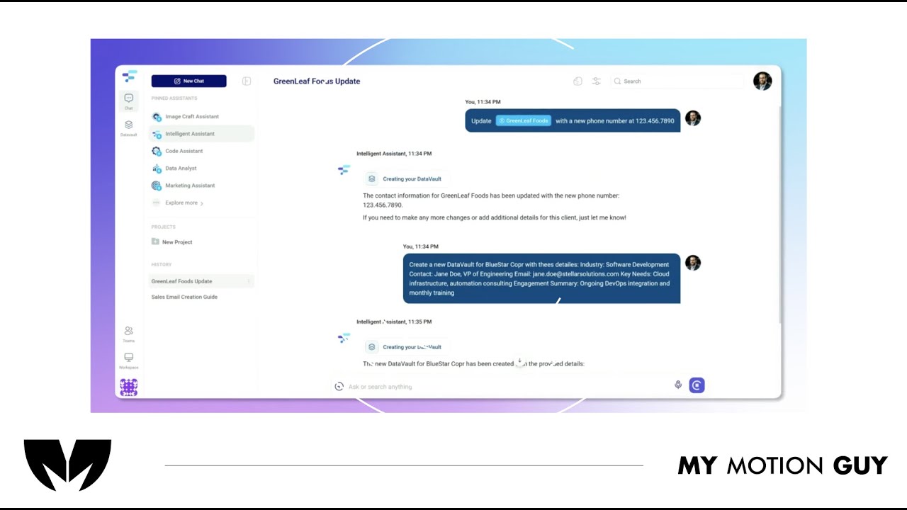
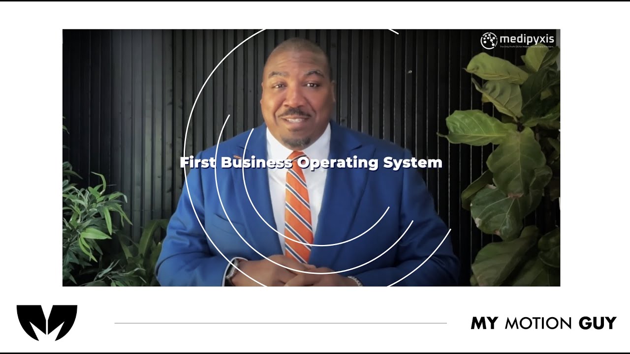
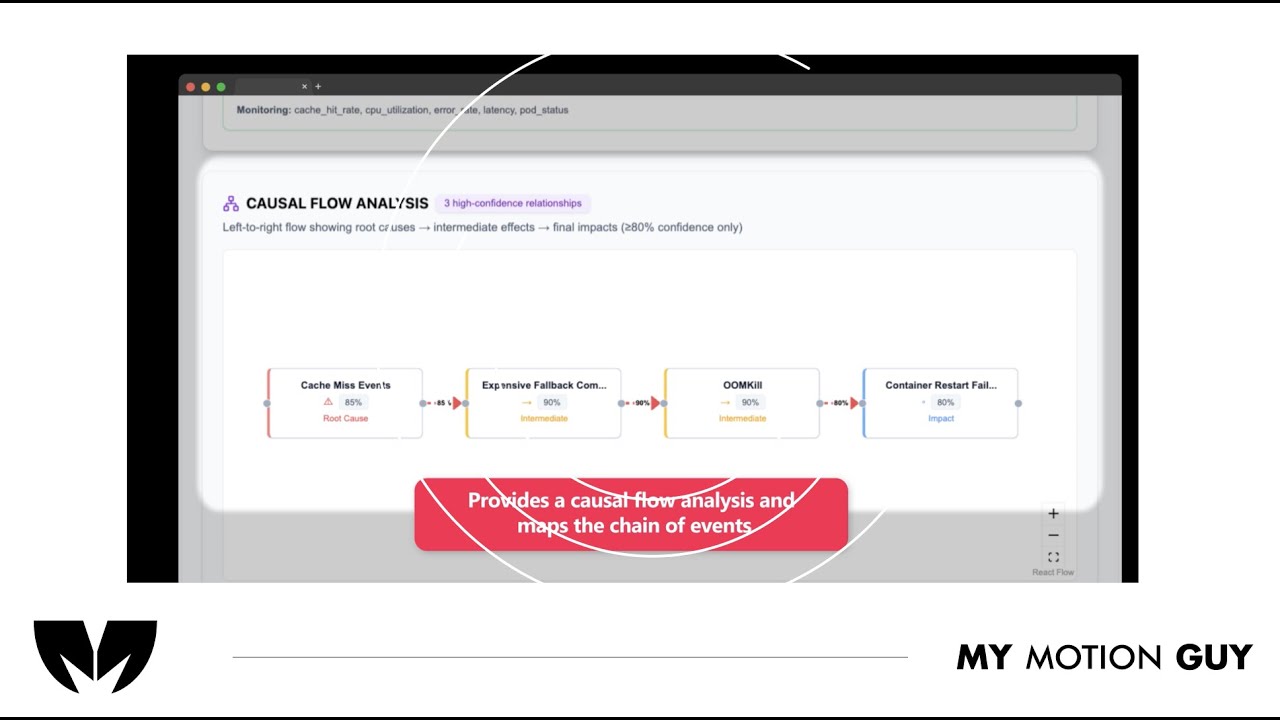
For this AI product demo, we cut the UI walkthrough tightly to the voice-over so every feature is shown exactly when it’s explained. The opening quickly establishes the product with a clean UI reveal, then the video moves through core actions using smooth scroll/zoom moves and masked wipes between screens to keep orientation clear. When “Data Vaults” come in, we switch into a more guided moment: cursor-led focus, highlight frames, and minimal callouts land right as the vault panel and context options appear, so the value clicks instantly. Sound stays polished and “trusty”: leveled VO, low music bed, and subtle click/soft whoosh accents on UI interactions and screen changes.
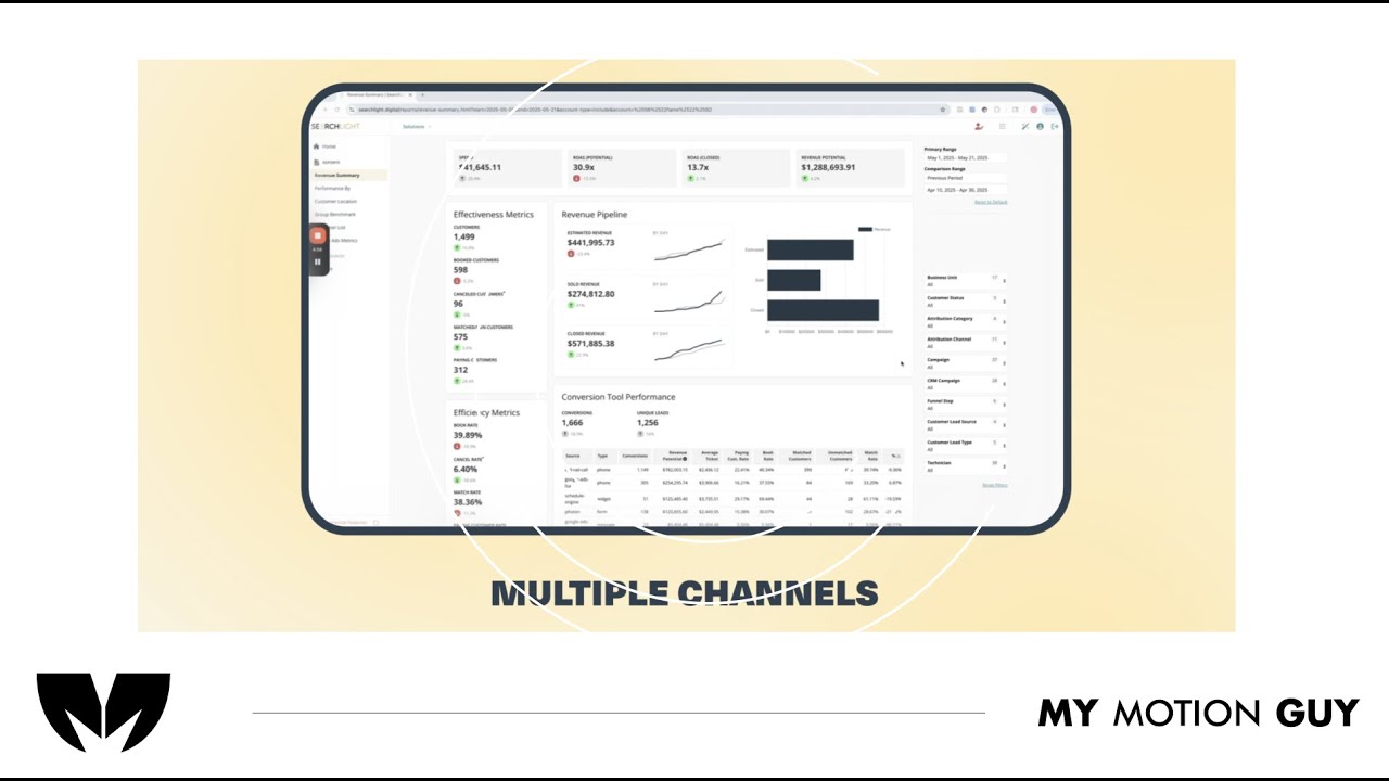
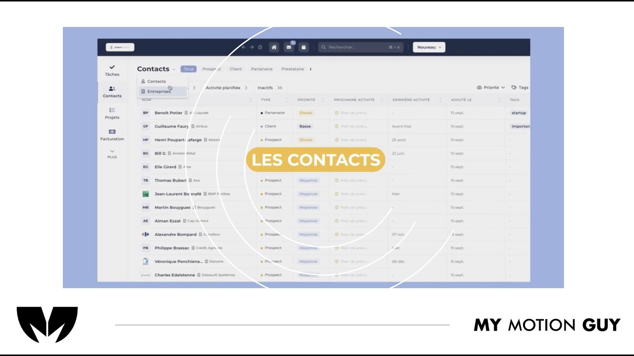
For this SaaS product dashboard UI walkthrough, we edited the story around the “all channels in one dashboard” idea, using UI walkthrough pacing to make insights feel instant. The opening hits with a clean dashboard reveal, then we move through key sections with smooth zoom pushes, scroll moves, and masked wipes to transition between channels, reports, and insights views. When performance metrics and insights appear, we reinforce them with minimal callouts and highlight frames that land exactly as the charts update, so the viewer understands what changed and why it matters. Sound design stays crisp and modern: subtle click taps on UI actions, soft whooshes on screen switches, and a controlled music bed to keep the demo premium and easy to follow.
For this AI online shopping agent promo, we cut the UI story tightly to the voice-over so the viewer sees the prompt, action, and result in one clear flow. The opening hooks with the agent prompt being typed, then we transition into shopping and cart screens using smooth zoom pushes and masked wipes that keep the “agent is working” feel continuous. When key benefits land, we support them with minimal callouts and highlight frames on the exact UI areas being referenced, so the value is obvious without clutter. Sound is clean and modern: leveled VO, a controlled music bed, subtle key-tap/click SFX on prompt and cart actions, and soft whooshes on screen switches for a premium finish.