
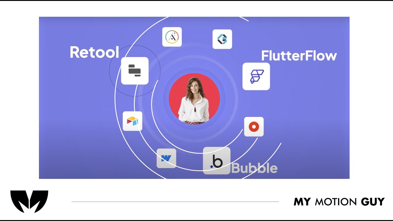
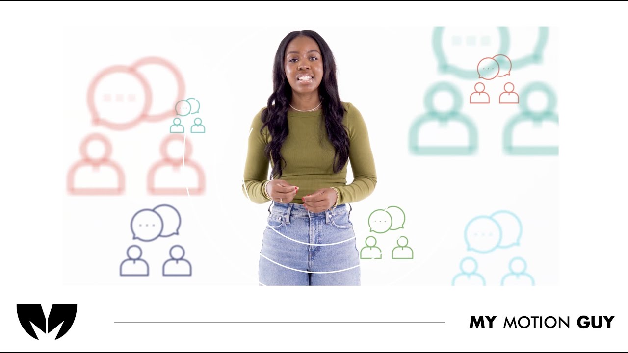
For this Rapid Dev, a SaaS product promo video, we focused on a fast, conversion-driven edit that communicates the offer in seconds. We shaped the storyline with tight pacing, clean jump cuts, and beat-matched transitions, then enhanced clarity with motion text callouts and polished visual timing so every line lands with impact. To elevate the final feel, we added sound design (whooshes, hits, risers), music leveling, and finishing touches like color correction and consistency pass across all shots, resulting in a modern, high-energy brand video built for web and social performance.
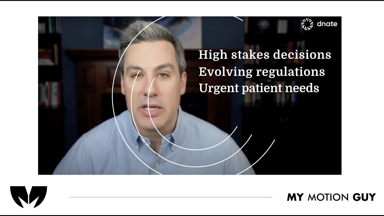
For the Dnate a corporate explainer video, we designed the edit to feel premium and forward-moving from the very start. In the opening, the pacing is intentionally tight, with clean cuts and quick visual switches to establish the brand fast and keep attention locked. During the main message sections, we use rhythmic transitions and polished visual timing so each new point lands cleanly, and the motion accents support the story without clutter. Toward the finish, the edit leans on sound design and music balancing to give the closing moments more lift and impact, with a final consistency pass to keep the full piece unified for website and social use.
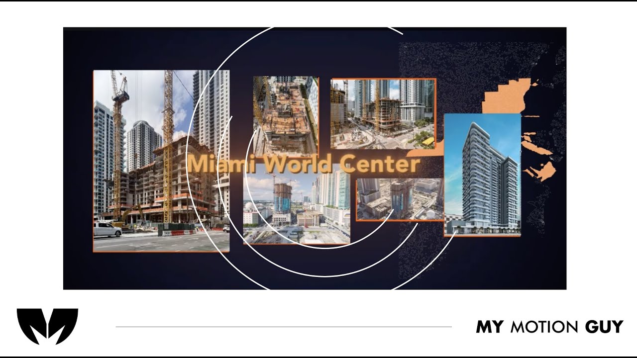
This commercial video ad for Miami World Center the edits are built to keep momentum from start to finish: a quick hook up front with tight cuts, beat-matched transitions as the visuals move through key points, punchy whoosh/hit accents on the scene switches, and clean motion text callouts whenever a new message lands, then a leveled music mix plus a final polish pass (consistency + color/contrast balance) to make it feel premium and web-ready.
For this Animated AI Product Demo, the entire edit is driven by 2D illustrations and animated UI screens,. We kept the opening fast to hook attention, then used smooth UI transitions, cursor style movement, and clean callouts to guide the viewer through key features as the interface changes. Sound design is tailored to the visuals with subtle click taps, whoosh accents on screen shifts, and a controlled music mix so every UI moment feels crisp, modern, and easy to follow.
For this VSL Promo, we built the edit around momentum and clarity. The opening uses tight selects and quick cut changes to hook fast, then the mid section leans on clean jump cuts and b-roll layering to keep the story moving while key moments land. You’ll feel the sound work most on the scene switches and message beats, with subtle whoosh and hit accents, plus music ducking under any key lines so the message stays clear. We finished with a consistency pass across all clips, balanced color and contrast, and a clean, web-ready export.
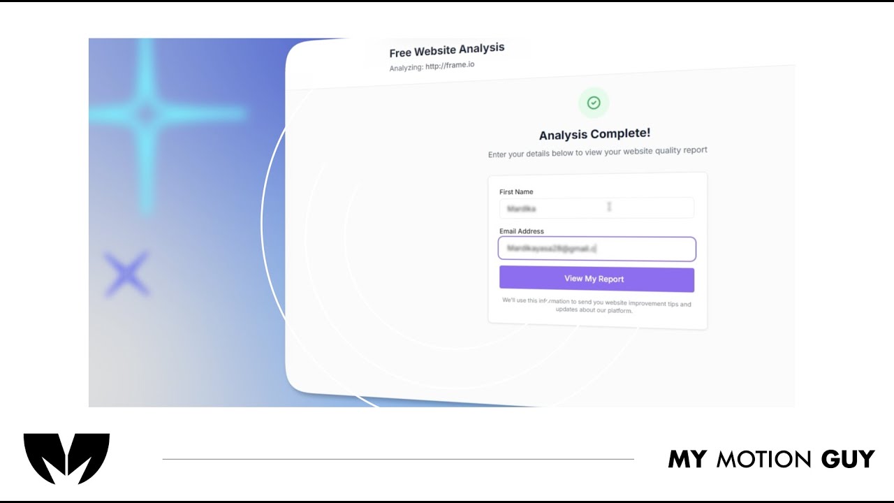
SaaS 2D Animation Explainer Video is built entirely around 2D motion graphics and animated UI, so the edit focuses on guiding the viewer through the interface with clarity. The opening hits fast with a clean UI reveal, then each feature beat is carried by smooth screen-to-screen transitions (slide-ins, zooms, and mask wipes) plus cursor-style movement that “leads” the eye to the next action. Sound design is matched to the UI moments with subtle click taps on interactions, soft whooshes on screen shifts, and short risers into key reveals, while clean callouts and typography keep every step easy to follow and visually premium.
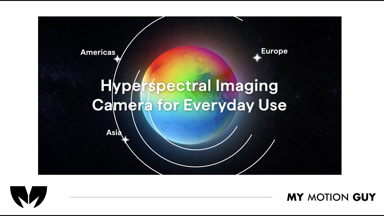
E-commerce Video Ad, promoting a hyperspectral Imaging Camera, we shaped the story entirely from raw footage, starting with a punchy hook that cuts quickly between the strongest product angles to create instant interest. In the mid section, we keep the pace tight by matching cuts to the music and using clean speed ramps on movement shots, then add minimal motion text callouts right when key features are shown so the viewer connects the benefit to what they’re seeing. Sound design is placed on the action: subtle whooshes on angle changes, crisp clicks on any button or interaction moments, and low hits on hero reveals, with music leveled to keep everything feeling premium. The final pass focuses on color and consistency across all clips so the product looks clean, sharp, and web-ready.
For this non-profit impact piece, we built the narrative around a photo-driven edit, then used motion graphics to make the results feel clear and credible. The opening relies on a fast image hook to establish the mission, followed by paced image sequences where each transition is timed to the message so the story keeps moving. As the impact points come in, we reinforce them with clean kinetic text and simple icon or stat-style motion graphics that sit on top of the images without distracting from the human moments. Sound is designed to support the reveals, with soft whooshes on image changes, subtle hits on key impact statements, and balanced music so the message stays front and center through the full video.
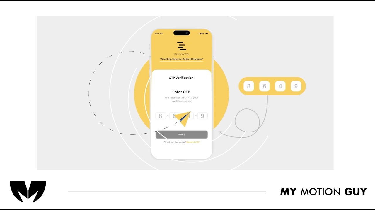
For this project management SaaS app animated promo, the story is told through animated UI screens and typography, not footage. The opening hits clear sound and messy graphics showing the problem around project management, then we move through the app feature beats using smooth screen-to-screen transitions like slide-ins, zoom pushes, and masked UI wipes that keep the flow clear. When the video shifts between web and mobile views, the motion guides the eye with cursor-style movement and callouts that land exactly as each UI element appears. Sound design is tied to the interface with click taps on interactions, soft whooshes on screen changes, and short risers into key reveals so the UI feels responsive and premium.
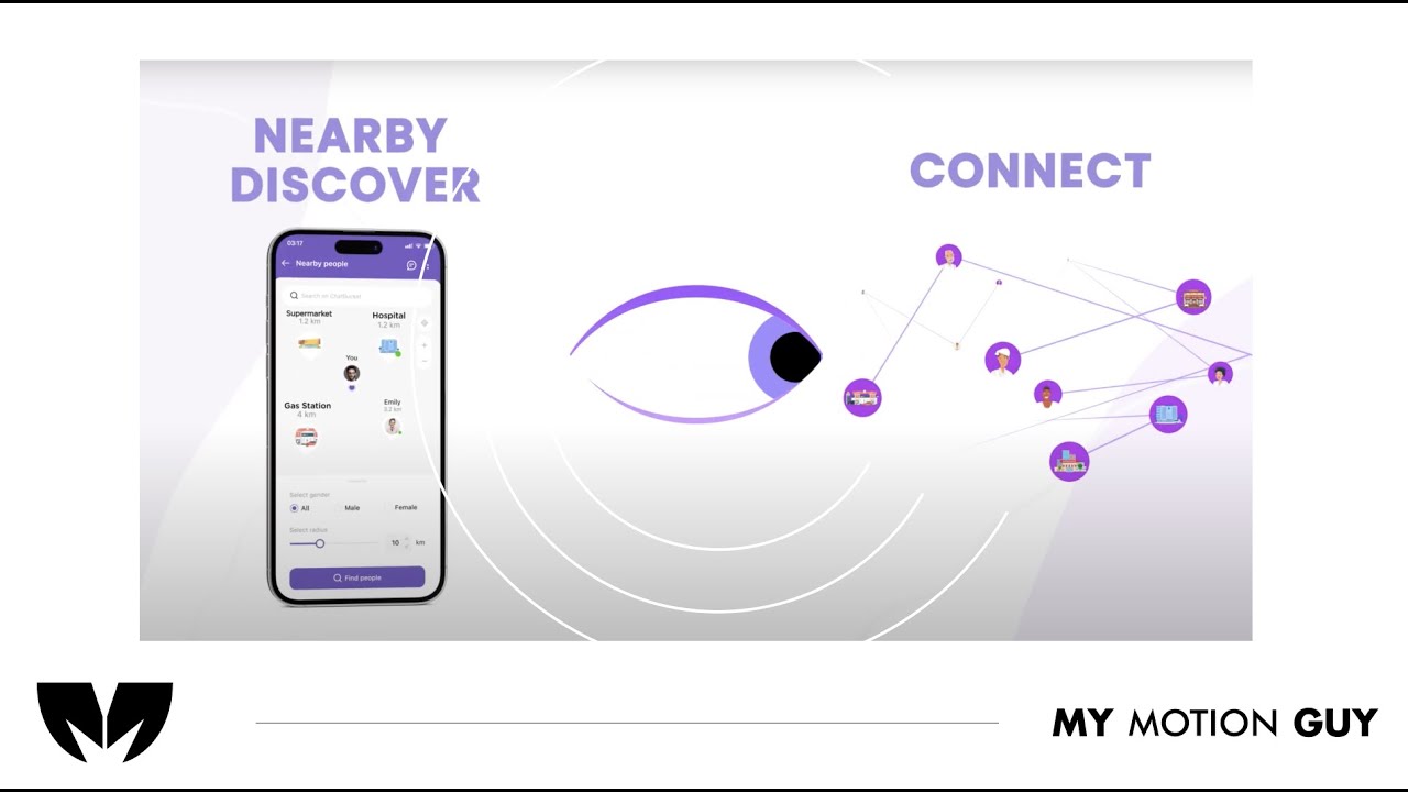
For this chat bucket explainer app promo, the story is carried through animated UI screens and kinetic typography (no live footage). The opening hits with a clean hero UI reveal, then we guide the viewer through the product using smooth screen-to-screen transitions like slide-ins, zoom pushes, and masked wipes so each new section feels connected. As key moments land, we bring in crisp type callouts that appear exactly when the UI updates, with cursor-style motion to “lead” attention to the next interaction. Sound design is matched to the interface with subtle click taps on UI actions, soft whooshes on screen changes, and short risers on feature reveals, finished with balanced music and a clean polish pass for a premium, web-ready feel.
For this real estate company commercial, we shaped the story entirely from raw footage, starting with a fast hook of the strongest exterior and interior highlights, then keeping momentum with clean cuts, smooth pacing, and polished transitions between spaces. Motion graphics and typography are used to support the visuals with clear on screen messaging, location and feature callouts, and a strong closing CTA without distracting from the property shots. Sound design is placed on the visual beats with subtle whooshes on transitions and low hits on key reveals, finished with a balanced music mix plus color and consistency work so the full piece feels premium and web ready.
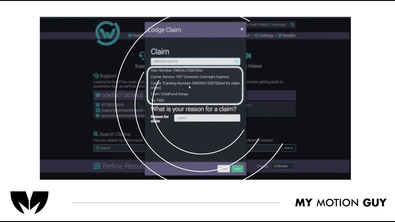
For this shipment platform screen casting tutorial, the edit is built around animated UI screens and typography to keep the walkthrough clear, step-by-step. We open with a quick UI overview, then move through each action using smooth screen-to-screen transitions (slide-ins, zoom pushes, and masked wipes) so the viewer always knows where to look. Each instruction is reinforced with crisp on-screen labels, highlights, and cursor-style movement that tracks the exact clicks and fields as the UI updates. Sound design stays subtle and functional: click taps on interactions, soft whooshes on section changes, and light risers on key completions, with a balanced music bed so the tutorial feels modern but never distracting.
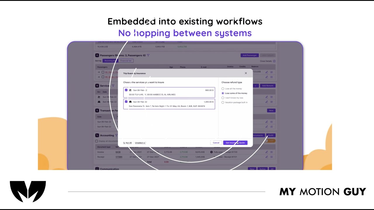
For SaaS UI walkthrough this video is edited as a UI go-through: it opens with a clean website entry, then guides the viewer through the flow using smooth scroll moves, zoom pushes, and masked wipes as screens change. When the AI analysis is introduced, we transition into the dashboard view with a crisp reveal and use minimal callouts to point to the key insight areas so the viewer immediately understands “input → analysis → results.” Sound design is matched to the UI actions with subtle click taps on interactions, soft whooshes on screen switches, and a light riser into the dashboard reveal, finished with a balanced music bed and a tidy polish pass for a premium SaaS feel.
For this travel agency digital dashboard UI walkthrough, we edited the UI flow to clearly showcase the offers and how to use each feature. The video opens with a quick dashboard overview, then moves section-by-section using smooth scroll moves, zoom pushes, and masked wipes to transition between menus and pages. Each offer reveal is reinforced with clean callouts and highlight frames that land exactly as the UI updates, making the steps easy to follow. Sound design supports the actions with subtle click taps on interactions, soft whooshes on screen changes, and light risers on key reveals, finished with a balanced music bed and a clean polish pass.
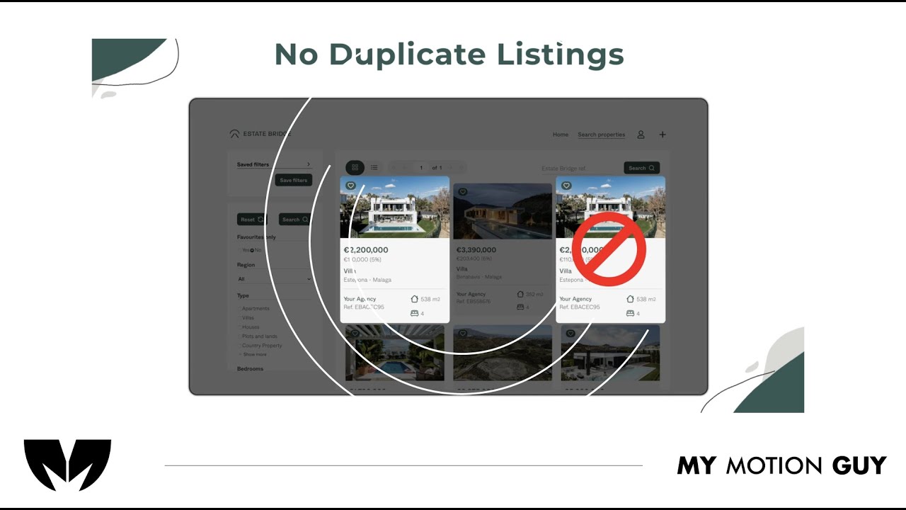
For this real estate listing platform UI walkthrough, we edited the UI to be fully visual since there’s no voice-over. The opening starts with a clean homepage/listing reveal, then the flow moves through key screens using smooth scroll moves, zoom pushes, and masked wipes to transition between search, listings, and details. Important features are communicated through minimal on-screen callouts and highlight frames timed to each UI change, while the sound approach stays intentional with subtle music only so the visuals remain the guide. A final polish pass keeps the UI crisp and consistent for a premium, website-ready demo.
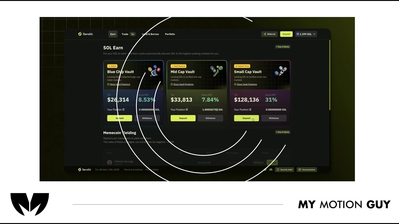
For this fintech crypto platform tutorial, we cut the UI walkthrough tightly to the voice-over so every step matches what the viewer hears. It opens with a quick dashboard overview, then moves through key actions using smooth scroll/zoom moves and clean masked wipes between screens to keep navigation clear. As features are explained, we layer minimal callouts, highlights, and cursor-led focus so the viewer instantly knows where to click and what changed on the interface. Sound work centers on clarity: VO is cleaned and leveled, music stays low, and subtle click/woosh accents land on UI interactions and screen transitions for a polished, trustworthy finish.
For this non-profit message video, we blended raw footage with 2D animation to keep the dialogue-led story engaging and easy for teens to follow. The opening uses real footage to ground the tone, then we transition into illustrated segments and on-screen typography whenever key ideas need extra clarity. Throughout the conversational beats, we use clean cutaways, simple motion graphic prompts, and supportive text callouts that appear right as the speaker makes each point, so the message lands without feeling preachy. Sound is treated carefully: dialogue is cleaned and leveled, music stays warm and controlled underneath, and subtle whoosh accents help the shift between footage moments and animated sections feel smooth and intentional.
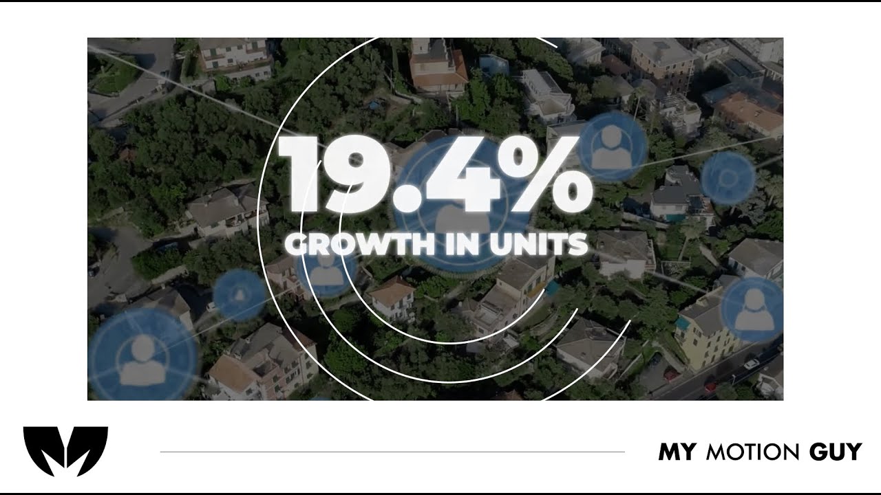
For this San Antonio real estate investment video, we built the flow by combining Google Earth zoom-ins, city visuals (still images + stock footage), and bold stat-driven motion graphics. The opening uses a map zoom to instantly set location, then we cut into city b-roll while large typography, charts, and simple graphs animate on top to highlight population, mortgages, and workforce data. Transitions stay smooth and energetic with zoom pushes and whip-style moves to connect map scenes to city shots, and each stat reveal lands on a clean beat with subtle whoosh/hit accents to make the numbers feel punchy. A final polish pass keeps footage, images, and graphic overlays consistent for a premium, investor-ready finish.
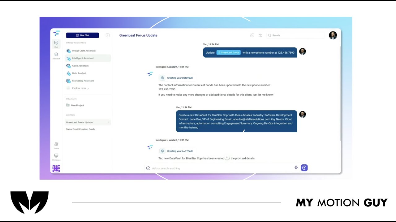
For this AI product demo, we cut the UI walkthrough tightly to the voice-over so every feature is shown exactly when it’s explained. The opening quickly establishes the product with a clean UI reveal, then the video moves through core actions using smooth scroll/zoom moves and masked wipes between screens to keep orientation clear. When “Data Vaults” come in, we switch into a more guided moment: cursor-led focus, highlight frames, and minimal callouts land right as the vault panel and context options appear, so the value clicks instantly. Sound stays polished and “trusty”: leveled VO, low music bed, and subtle click/soft whoosh accents on UI interactions and screen changes.
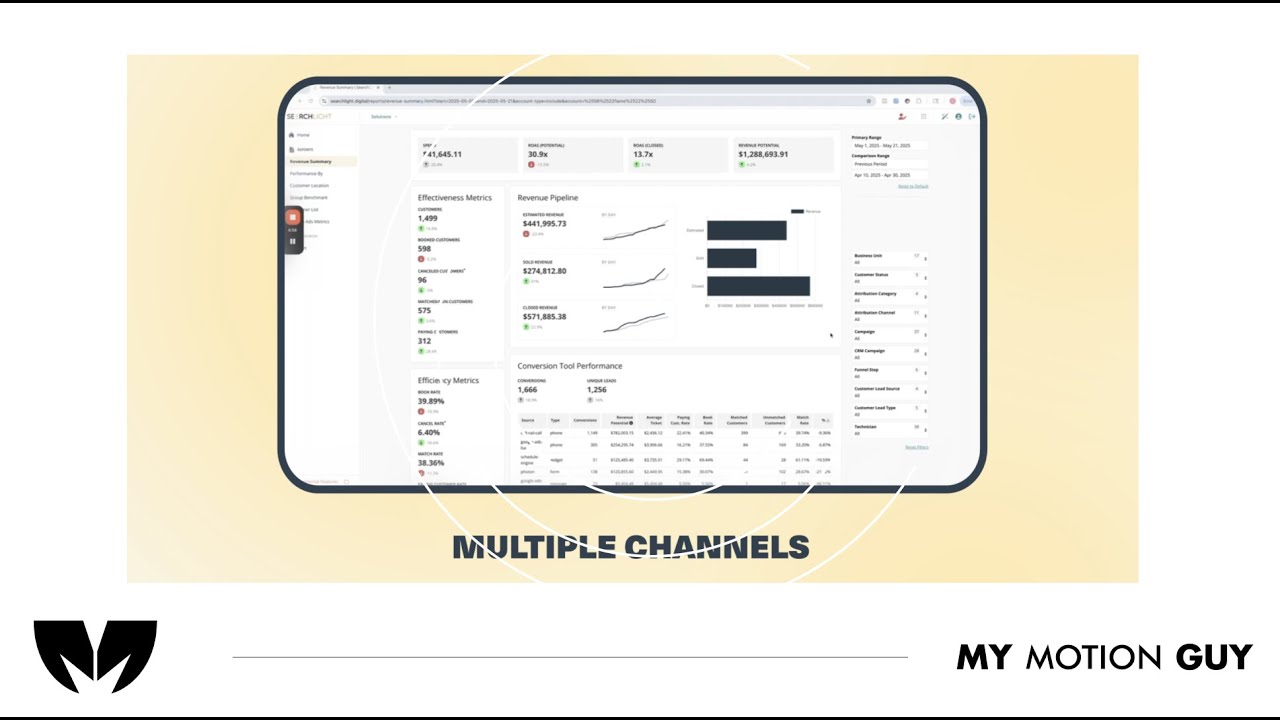
For this SaaS product dashboard UI walkthrough, we edited the story around the “all channels in one dashboard” idea, using UI walkthrough pacing to make insights feel instant. The opening hits with a clean dashboard reveal, then we move through key sections with smooth zoom pushes, scroll moves, and masked wipes to transition between channels, reports, and insights views. When performance metrics and insights appear, we reinforce them with minimal callouts and highlight frames that land exactly as the charts update, so the viewer understands what changed and why it matters. Sound design stays crisp and modern: subtle click taps on UI actions, soft whooshes on screen switches, and a controlled music bed to keep the demo premium and easy to follow.